PurdyAndrewMacelleria
“Macelleria," Andrew Purdy
Colored pencils have come a long way. Just 27 years ago, most people regarded them “as a medium for quick sketches, advertising and architectural renderings, and children’s drawings,” said artist Deborah Maklowski of the Colored Pencil Society of America (CPSA). Back then, CPSA’s product research director added, only “a few dozen professional artists were already exploring the medium’s incredible potential and producing artwork that, by every known measure, met the standard for fine art.”
The 25th annual CPSA international exhibition, on view through Aug. 6 in the Mansion at Strathmore, challenges those outdated perceptions. In the process of selecting 118 works from among some 500 submitted for consideration, juror Joann Moser was impressed “by work that intrigued me, sustained my interest, and moved or challenged me.” Moser was the senior curator of graphic arts at the Smithsonian American Art Museum for 30 years.
Artist Vera Curnow founded the CPSA in 1990 to promote the medium, provide its artists with a support network and “to elevate colored pencil to a stature equal to that of other fine art media in the eyes of galleries, critics, collectors and other artists,” Maklowski explained. CPSA, with a member that has grown from 66 to 1,800 charter members, will award $17,000 in prizes to exhibiting artists, and hold its convention July 25 through 29 at the Hilton in Rockville.
In conjunction with the society’s goals, colored pencil works “absolutely…are– and should be–evaluated by the same criteria as artwork done in any other medium, and they should be held to the same standards of excellence,” Maklowski said. “While the process of evaluating an artist’s technical knowledge of and skill with any given medium may prompt different questions—for example, the use of mediums; brushwork and mark-making; focus and aperture, etc.–the image produced should clearly demonstrate an artist’s understanding of the principles of design and composition, a mastery of materials and a uniqueness of creative vision.”
CPSA has “made significant progress,” Maklowski pointed out. “Now books and articles appear regularly; classes are taught at the college level; there has been an exponential growth in the number and quality of professional-grade colored pencils and other products and materials available to colored pencil artists; galleries, museums and other venues exhibit colored pencil works; and other countries have started national colored pencil societies of their own.” Maklowski, who holds an art history degree from Virginia Commonwealth University, has had a piece juried into CPSA’s annual exhibit six times, including the current one. “The medium of colored pencil,” she said, “suits me because, like many artists working in colored pencil, I love to draw more than anything else. It is compelling and deeply satisfying,” she said.
Colored pencil, she added, “is often the medium of choice for artists who love to render incredibly detailed subjects with remarkable fidelity to reality because it can produce both very precise marks and soft color transitions. A layer of colored pencil is translucent, and the most beautiful results are achieved by glazing multiple layers of pencil colors lightly over one another, For that reason, it is also a medium where planning can be key to success. Erasing colored pencil is not impossible but can be difficult, and it’s often useful to plan out the sequence of pencil layers in advance to reach the desired color goal.”
Strathmore staffers Gabrielle Tillenburg, visual arts coordinator, and Lesley Lundgren, exhibition manager, coordinated with Maklowski on mounting the exhibit. Tillenburg, who studied film production at the University of Central Florida, said she “approaches hanging works of art in a room the same way I approach editing film and video. I consider how my eye moves within one composition and then on to another work of art, similarly to how my eye will move from one frame of video to the next.
“The result is an exhibition that encourages the viewer’s eye to move from one work to another, creating a visual rhythm and building relationships between works whether it be through color, texture or shape. In our Dining Room gallery, the viewer may find themselves navigating grid-like patterns and plays on perspective, then moving into our Main Hall to compositions featuring diagonal angles, representations of mechanical gears, and a sense of luminosity in each work.”
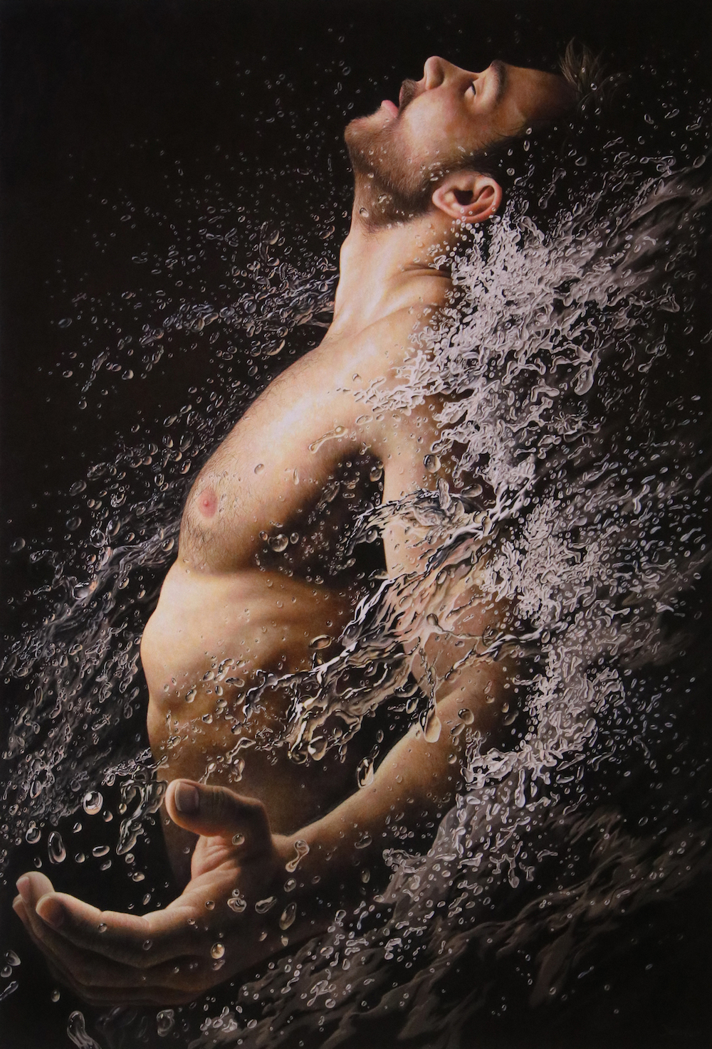
The Mansion, which she said has “some fun spaces to play around with art placement,” pointing out that “as the viewer ascends our grand staircase, they find themselves looking up through a car windshield at a man looking back down at them.” And Jesse Lane’s photorealistic “Adrenaline,” said Tillenburg, was deliberately “placed in our Main Hall near the entrance to the exhibition” because she “knew this piece would make a splash—pun intended—because aside from its dramatic subject, it’s a piece that immediately confronts what you think you know about colored pencils.”
Lundgren has found that visitors are “amazed” that these works are created in 100 percent colored pencil, that the medium “can be so lush and vibrant and that these artists can render work that is so realistic. It fools people. They think they are looking at paintings or photos and when they find out it’s pencil, they are astounded.”
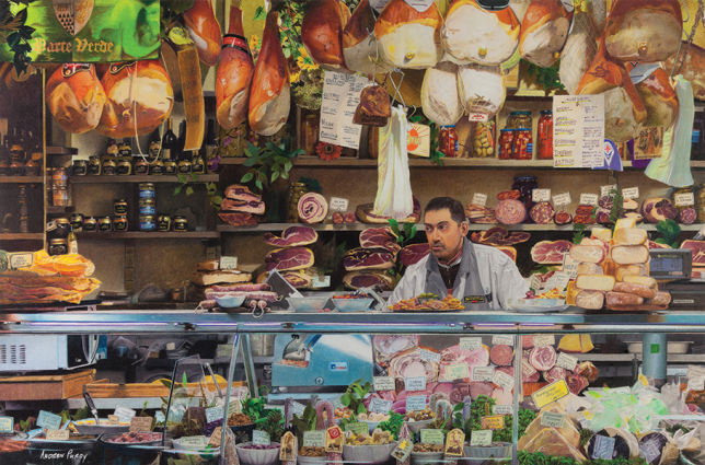
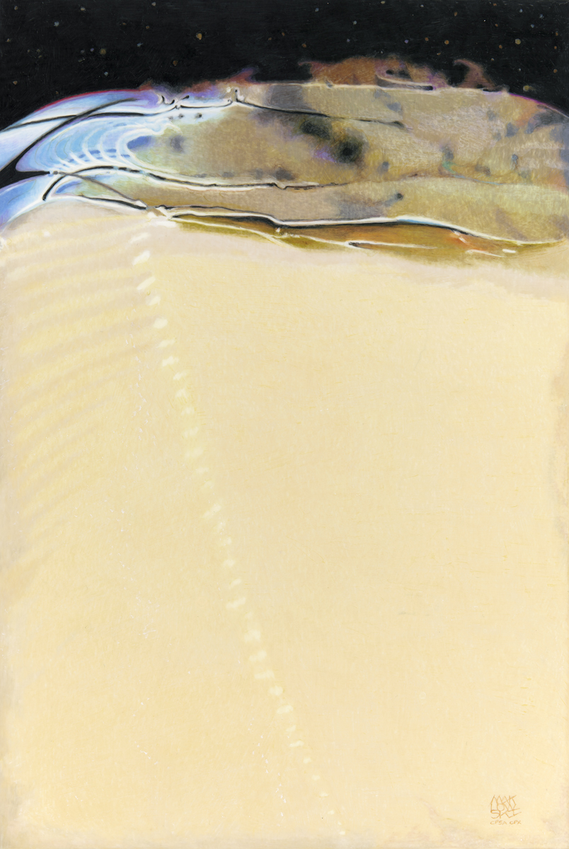
Tillenburg noted that viewers have been drawn to Bonnie Auten’s “Piece by Piece” “for its trompe l’oeil effect–the work looks as if it’s a jigsaw puzzle pieced together;” retired Los Angeles detective Andrew Purdy’s “Macelleria” “because of the amount of detail poured into the work that showcases a deli scene with varying meats and other products in painstaking detail down to the lettering of jar labels.” Her personal favorites include Maklowski’s “Sirocco,” one of the show’s few abstracts. “Its imagery reminds me of glitch video in the way that the colors melt up across the composition. Deborah disclosed that the work is actually based on an extreme closeup of butter melting in a pan, and I love that she’s created something that looks almost cosmic out of such an everyday object.”
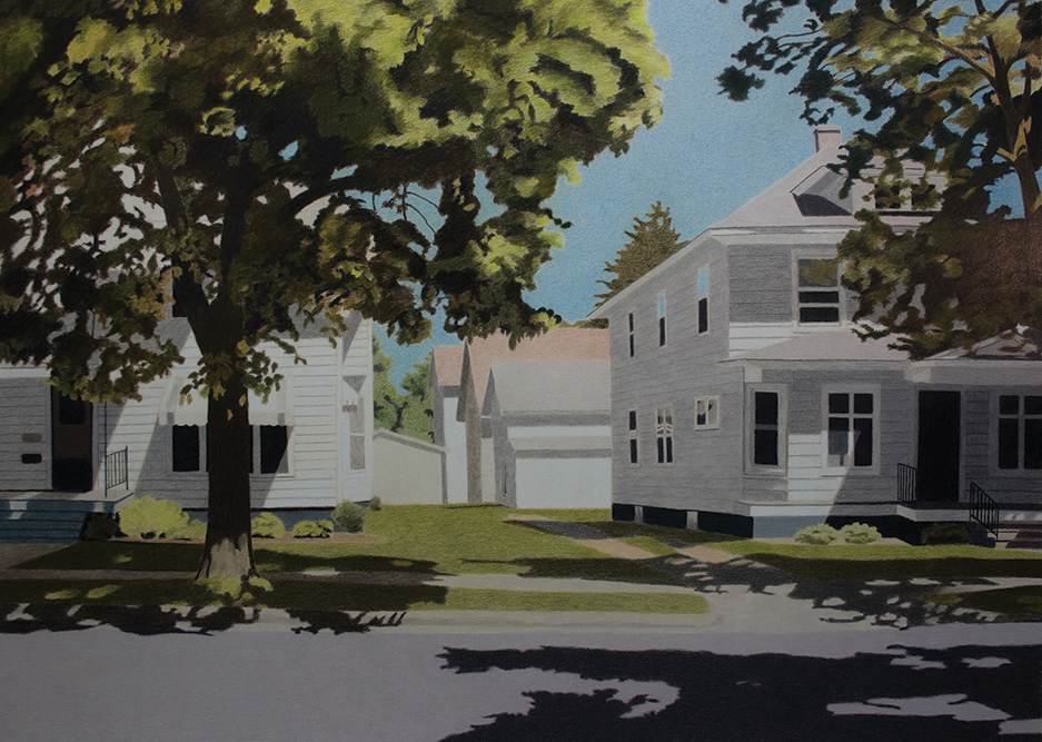
Both Tillenburg and Maklowski like Jody Beighley’s “Hot August Day.” Tillenburg said it “presents a suburban setting that evokes a dreamy sense of nostalgia. I love its muted color palate and softness, which upon closer inspection, is due to the texture of the paper. Jody has chosen not to fill in small amounts of white space in the valleys of the paper which creates this soft look.” Maklowski observed that the artist’s “signature style is to break her subject matter into a series of flat planes of color, almost like puzzle pieces, that, because of her mastery of color’s attributes–hue, value, temperature and intensity–successfully create the illusion of a real landscape, with fore-, mid- and background firmly established. With these simple shapes and an elegant composition, she perfectly captures the quintessential elements of a quiet side street in a small American town on a sunny, summer day: white clapboard houses, an unpaved driveway, shady trees, and dappled light on sidewalk, yards, and porches. This is a subject that will resonate strongly with nearly everyone who sees this piece.”
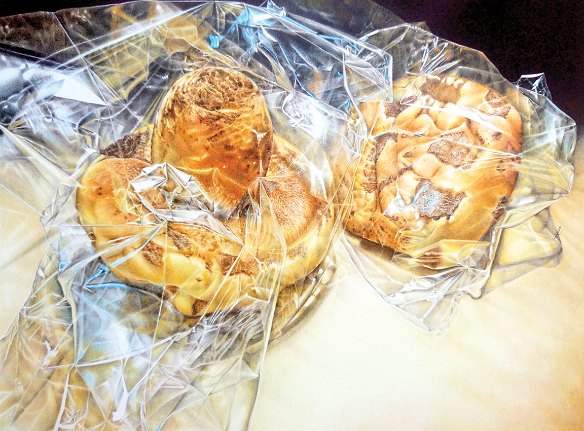
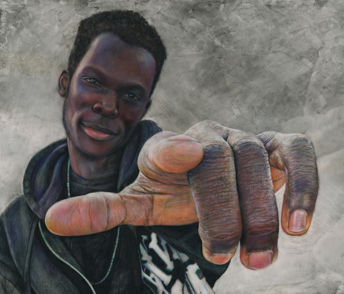
Maklowski’s also favors Carolyn Chua’s “I See Bread,” which she described as “a skillfully executed drawing of two loaves of bread wrapped in cellophane–the subject is almost immaterial: it succeeds first and foremost as an abstract, based on a beautifully balanced compositional design and a carefully selected palette of golds, ochres, browns, black and white. That palette would work well alone, but the artist has added, here and there, pops of a strong blue which make the whole piece sing,” and Barbara Dahlstedt’s “You Can Make a Difference,” which she admires for the artist’s impeccable technical skills, but even more so, for “the kindness and intelligence that radiate from the subject. Portrayed in a pose that could be considered provocative, even challenging, the expression on the young man’s face instead makes the viewer feel engaged and empathetic, forging a genuine human connection with him.”
Lundgren also loves Purdy’s “Macelleria,” the market scene characterized by “attention to detail and how he captures reflection on the jars and countertops. The artist is creating a place I’ve never seen, but I can hear the sounds and practically smell the foods and this work takes me there.” Marsha Gilger’s “Bachelor Pad” is another favorite. “I like that she leaves some of the paper untouched by the pencil. I love the that the bark is so tactile and the ducks’ feathers are so smooth and soft. She has a great command of the blue. I know she has layered blues with other colors to get just the right saturation and like almost any feather, there is a rainbow of color when the light hits the surface in the right moment. I also love the title!”
There is truly something for everyone, young and old, to appreciate within this exhibit’s variety of subject matter and technique. Yet perhaps most important, the 118 works comprise a convincing statement that colored pencil art qualifies as fine art.
The 25th annual CPSA International Exhibition is on view through Aug. 6 at The Mansion at Strathmore, 10701 Rockville Pike, North Bethesda. Hours are 10 a.m. to 4 p.m. Tuesday, Thursday, Friday and Saturday; 10 a.m. to 9 p.m. Wednesday and noon to 4 p.m. Sunday. Admission is free. Call 301-581-5100 or visit www.strathmore.org. For information about the CPSA International Convention, visit www.cpsa.org. View this exhibit on CultureSpotMC here.